Creating Dynamic Forms in Angular: A Step-by-Step Guide

In Angular Apps, making and updating forms is done by hand. Even small changes like adding a new field or changing its type can be difficult. Why not make forms adaptable to business changes?
Why not transition to dynamic forms instead of hard-coded ones, making it easier to adapt to business changes and update form declarations and fields?
Today, we'll learn to make forms with reactive forms from a model and connect them to inputs, radio buttons, and checkboxes in a flexible template.
👍Thanks to the community for their questions, which help improve the article to better align with more business requirements and help a lot of people.
Scenario
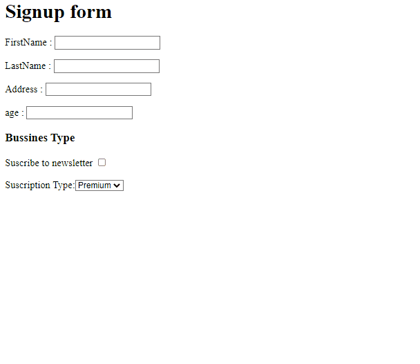
We work for the marketing team, which wants a form to request the users' Firstname, Lastname, and age. Let's build it.
First, declare a FormGroup field registerForm and create the method buildForm() to manually add every field in the formGroup.
import { Component, OnInit, VERSION } from '@angular/core';
import { FormControl, FormGroup } from '@angular/forms';
@Component({
selector: 'my-app',
templateUrl: './app.component.html',
styleUrls: ['./app.component.css'],
})
export class AppComponent implements OnInit {
registerForm: FormGroup;
ngOnInit() {
this.buildForm();
}
buildForm() {
this.registerForm = new FormGroup({
name: new FormControl(''),
lastName: new FormControl(''),
age: new FormControl(''),
});
}
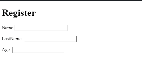
}Add the HTML markup with the inputs linked with the form using the [formGroup] directive.
<h1>Register</h1>
<form [formGroup]="registerForm">
  <label>Name:<input type="text" formControlName="name" /></label>
  <label>LastName: <input type="text" formControlName="lastName" /></label>
  <label> Age: <input type="number" formControlName="age" /></label>
</form>
And Finally, we have our static forms!
But tomorrow, marketing wants to request the address or a checkbox for the newsletter. We need to update the form declaration, add the formControl and the inputs, and you know the whole process.
We want to avoid repeating the same task every time. We need to turn on the form to dynamic and react to business changes without touching the html or typescript file again.
Create Dynamic FormControl and Inputs
First, we will have two tasks to build our form dynamic.
-
Create the Form Group from the business object.
-
Show the list of fields to render in the form.
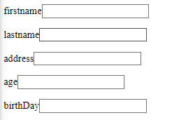
First, rename registerModel to model and declare the fields` array. It will have all elements with inputs model for our dynamic form:
fields: [];
model = {
        name: '',
        lastName: '',
        address: '',
        age: '',
 };
Next, create the method getFormControlFields(), with theformGroupFields object and Iterate over all properties in the model using the for, to push in formGroupFields. Add every field into the fields array.
The code looks like this:
 getFormControlsFields() {
        const formGroupFields = {};
        for (const field of Object.keys(this.model)) {
            formGroupFields[field] = new FormControl("");
            this.fields.push(field);
        }
        return formGroupFields;
    }
HOLD A SECOND! Do you want to learn to build complex forms and form controls quickly??
Check out the Advanced Angular Forms & Custom Form Control Masterclass by Decoded Frontend.

In the buildForm() method, add the variable formGroupFields with the value from getFormControlFields() and assign the formGroupFields to the registerForm.
 buildForm() {
    const formGroupFields = this.getFormControlsFields();
    this.registerForm = new FormGroup(formGroupFields);
  }
Next, render the fields in the HTML, using the *ngFor directive to iterate over the fields array. Use the variable field to show the label and set the input [formControlName] with the same field value.
<form [formGroup]="registerForm">
    <div *ngFor="let field of fields">
           <label>{{field}}</label>
    <input type="text" [formControlName]="field"/>
</form>
Save changes, and we get the same form, generated dynamically, from the definition.

But it's just the beginning. We want to split a little bit of the responsibility to allow us to make the form flexible to changes without pain.
Separate the Form Process and FieldType
The app.component does a few tasks, creating the model, form, and rendering the input. Let's clean it up a little bit.
Create the dynamic-form.component with an input property to get the model to generate, and update registerForm to dynamicFormGroup. Move the function buildForm and getFormControlsFields to the dynamic form component.
import { Component, Input, OnInit } from "@angular/core";
import { FormControl, FormGroup } from "@angular/forms";

@Component({
  selector: "app-dynamic-form",
  templateUrl: "./dynamic-form.component.html",
  styleUrls: ["./dynamic-form.component.css"],
})
export class DynamicFormComponent implements OnInit {
  dynamicFormGroup: FormGroup;
  @Input() model: {};

  fields = [];

  ngOnInit() {
    this.buildForm();
  }

  buildForm() {
    const formGroupFields = this.getFormControlsFields();
    this.dynamicFormGroup = new FormGroup(formGroupFields);
  }

  getFormControlsFields() {
    const formGroupFields = {};
    for (const field of Object.keys(this.model)) {
      formGroupFields[field] = new FormControl("");
      this.fields.push(field);
    }
    return formGroupFields;
  }
}
Remember to update the formGroup in the html to dynamicFormGroup
Next, create a new component dynamic-field with the responsibility of rendering the field. Add two Input() properties field and formName.
import {Component, Input} from "@angular/core";

@Component({
  selector: "app-field-input",
  templateUrl: "./dynamic-field.component.html",
  styleUrls: ["./dynamic-field.component.css"],
})
export class DynamicFieldComponent {
  @Input() field: {};
  @Input() formName: string;
}
Add the HTML markup with the input and the label.
<form [formGroup]="formName">
    <label>{{field}}</label>
    <input type="text" [formControlName]="field"/>
</form>
Open the app.component to pass the model to the dynamic form. It takes the responsibility to process the model, and the dynamic-field renders the input.
import { Component } from "@angular/core";

@Component({
  selector: "my-app",
  templateUrl: "./app.component.html",
  styleUrls: ["./app.component.css"],
})
export class AppComponent {
  model = {
    name: "",
    lastName: "",
    address: "",
    age: "",
  };
}
The HTML passes the property model with the definition.
<app-dynamic-form [model]="model"></app-dynamic-form>Perfect, we have a few separate tasks and responsibilities. The following challenge shows different control types.
Show Inputs By Type
The Dynamic form renders a single type of input. In a real-world scenario, we need more types like date, select, input, radio, and checkbox.
The information about the control types must come from the model to the dynamic-field.
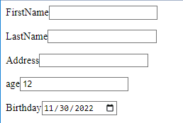
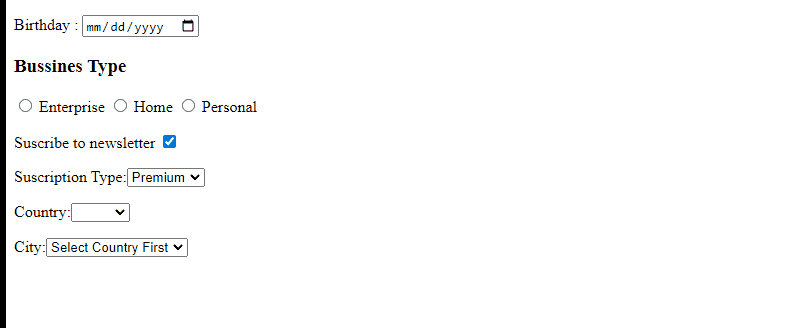
Change the model with the following properties type, value, and label. To make it a bit fun, change the age to type number, and create a new property birthDay of type date.
model = {
    firstname: {
      type: "text",
      value: "",
      label: "FirstName",
    },
    lastname: {
      type: "text",
      value: "",
      label: "LastName",
    },
    address: {
      type: "text",
      value: "",
      label: "Address",
    },
    age: {
      type: "number",
      value: "",
      label: "age",
    },
    birthDay: {
      type: "date",
      value: "",
      label: "Birthday",
    },
  };
}
Save the new field birthDay shown in the form.
We will make small changes in the getFormsControlsFields method to process the metadata.
Please create a new variable, fieldProps to store the field with the metadata from the model. Use the value property to assign the formControl and push the field with the property fieldName in the fields array.
We will use the metadata properties in the dynamic-field component
getFormControlsFields() {
    const formGroupFields = {};
    for (const field of Object.keys(this.model)) {
      const fieldProps = this.model[field];
      formGroupFields[field] = new FormControl(fieldProps.value);
this.fields.push({ ...fieldProps, fieldName: field });
    }
    return formGroupFields;
  }
Finally, go to the dynamic.component.html and use these properties field.label, change formControlName to use field.fieldName, and bind the type with field.type.
<form [formGroup]="formName">
    <label>{{field.label}}</label>
    <input [type]="field.type" [formControlName]="field.fieldName"/>
</form>
Save the changes and see the new controls with a type.
Add Selects, Radios, and Checkbox
The dynamic field component shows the input, but adding controls like select, radio, or checkbox makes it a bit complex. I want to split each control into specific controls.
Create components for each control dynamic-input dynamic-radio, dynamic-select, and dynamic-checkbox.
ng g components/dynamic-field/dynamic-checkbox
ng g components/dynamic-field/dynamic-radio
ng g components/dynamic-field/dynamic-select
ng g components/dynamic-field/dynamic-input
Every component has two points in common, the field with metadata and the FormGroup to like with the main form.
Let's start with the Input and Checkbox:
Input
Declare the field object with metadata and the formName as input properties.
export class DynamicInputComponent {
  @Input() field: {};
  @Input() formName: FormGroup;
}
In the HTML Markup, use the metadata with the label and the formControlName with the fieldName.
<form [formGroup]="formName">
    <label>{{field.label}}</label>
    <input [type]="field.type" [formControlName]="field.fieldName"/>
</form>
Checkbox
Like the dynamic-input component, add two fields with the field metadata and the formGroup.
export class DynamicCheckboxsComponent {
  @Input() field: any;
  @Input() formName: FormGroup;
}
In the HTML Markup, add a checkbox.
<form [formGroup]="formName">
    <label>
        {{ field.label }}
        <input
                type="checkbox"
                [name]="field.fieldName"
                [formControlName]="field.fieldName"
                [value]="field.value"
        />
    </label>
</form>
I want to split the checkbox from the input for personal reasons; the checkbox sometimes has particular styles.
Select
The properties are the same, but the metadata will become different. The select has a list of options, so we need to iterate over the list using the ngFor directive.
The HTML Markup looks like this:
<form [formGroup]="formName">

    <label>{{field.label}}:</label>
    <select [formControlName]="field.fieldName">
        <option *ngFor="let option of field.options" [value]="option.value">
            {{option.label}}
        </option>
    </select>
</form>
Radio
The radio is close, similar to the select with a list of options, but with a particular case, the name must be the same to allow select one single option. We add an extra label to show the option label.
<form [formGroup]="formName">
    <h3>{{field.label}}</h3>
    <label *ngFor="let option of field.options">

        <label ngFor="let option of field.options">
            <input type="radio"
                   [name]="field.fieldName"
                   [formControlName]="field.fieldName"
                   [value]="option.value"
            >
            {{option.label}}
        </label>
    </label>
</form>
Ok, all components are ready, but with two missing points: show the components and update the metadata.
Show Dynamic Components And Update Model
We have components for each control type, but the dynamic-field.component is a bridge between them.
It picks the specific component by type. Using the ngSwitch directive, we determine the control matching with the component type.
The final code looks like this:
<ng-container [ngSwitch]="field.type">
    <app-dynamic-input *ngSwitchCase="'text'" [formName]="formName" [field]="field"></app-dynamic-input>
    <app-dynamic-select *ngSwitchCase="'select'" [formName]="formName" [field]="field"></app-dynamic-select>
    <app-dynamic-radio *ngSwitchCase="'radio'" [formName]="formName" [field]="field"></app-dynamic-radio>
    <app-dynamic-checkboxs *ngSwitchCase="'checkbox'" [formName]="formName" [field]="field"></app-dynamic-checkboxs>
</ng-container>
Learn more about switchCase
Next, we add new fields with the metadata for each type:
typeBussines: radio suscriptionType: select newsletterIn: checkbox
The type radio and select must have the options object with { label, value} fit component expectations.
   typeBussines: {
      label: "Bussines Type",
      value: "premium",
      type: "radio",
      options: [
        {
          label: "Enterprise",
          value: "1500",
        },
        {
          label: "Home",
          value: "6",
        },
        {
          label: "Personal",
          value: "1",
        },
      ],
    },
    newsletterIn: {
      label: "Suscribe to newsletter",
      value: "email",
      type: "checkbox"
    },
    suscriptionType: {
      label: "Suscription Type",
      value: "premium",
      type: "select",
      options: [
        {
          label: "Pick one",
          value: "",
        },
        {
          label: "Premium",
          value: "premium",
        },
        {
          label: "Basic",
          value: "basic",
        },
      ],
    },
Save and reload. The new components work with the structure and the dynamic-field picks the specific component.
Validations
We need a complete form with validations. I want to make this article brief, but validation is essential in the forms.
My example is basic about adding a required validator but feel free to add more if you want.
First, we must change the model with new metadata rules, with the field required with the true value.
firstname: {
      type: "text",
      value: "",
      label: "FirstName",
      rules: {
        required: true,
      }
    },
The validators are part of the form controls. We process the rule to set the validator for the formControl in a new method, addValidators, and the return value stored in the validators variable to assign in the formControl.
      const validators = this.addValidator(fieldProps.rules);
      formGroupFields[field] = new FormControl(fieldProps.value, validators);
If the rule object is empty, return an empty array
In the addValidator, use the Object.keys and iterate over every property in the rules object. Use a switch case to math with the value and return the Validator.
In Our scenario, the rule required returns the Validator.required.
  private addValidator(rules) {
    if (!rules) {
      return [];
    }

    const validators = Object.keys(rules).map((rule) => {
      switch (rule) {
        case "required":
          return Validators.required;
          //add more cases for the future.
      }
    });
    return validators;
  }
Ok, we already configure the formControl with the validator, but we need to show the label if the control is invalid. Create a new component, dynamic-error , with two input properties, formGroup, and fieldName.
import { Component, Input } from "@angular/core";
import { FormGroup } from "@angular/forms";

@Component({
  selector: "app-dynamic-error",
  templateUrl: "./dynamic-error.component.html",
  styleUrls: ["./dynamic-error.component.css"],
})
export class DynamicErrorComponent {
  @Input() formName: FormGroup;
  @Input() fieldName: string;
}
We find the control by name using the form reference in the HTML. If it is invalid, dirty, or touched by the user, show a message.
<div *ngIf="formName.controls[fieldName].invalid && (formName.controls[fieldName].dirty || formName.controls[fieldName].touched)"
     class="alert">
    <div *ngIf="formName.controls[fieldName].errors.required">
        * {{fieldName}}
    </div>
</div>
Finally, add the dynamic-error component in the dynamic-form component and pass the fieldName and the formGroup.
<form [formGroup]="dynamicFormGroup">
    <div *ngFor="let field of fields">
        <app-field-input [formName]="dynamicFormGroup" [field]="field"></app-field-input>
        <app-dynamic-error [formName]="dynamicFormGroup" [fieldName]="field.fieldName"></app-dynamic-error>
    </div>
</form>
Read more about validators in Angular
Yeah!! The validators work with our dynamic forms.
You have a stable version of dynamic forms if you reach this part. I try to make this post short, but I hear feedback from other users like @Juan Berzosa Tejero and .... motivated to do some refactors.
Refactor Time
Propagation of FormGroup
After @Juan Berzosa Tejero take time to review the article, he asked me about the propagation of FormGroup using the @Input() with formName, and it starts to make noise. Luckily I found the directive FormGroupDirective in the Angular Documentation. It helps us to bind an existing FormGroup or FormRecord to a DOM element.
I decide to use and refactor the code; we are going to start with the dynamic-error.component to simplify, but the steps are similar for all child components.
Remove the @Input() decorator from formName and inject the FormGroupDirective in the component constructor.
Add the ngOnInit lifecycle to set the formName with the FormGroupDirective.control to bind the FormGroup to it.
The final code looks like this:
import { Component, Input, OnInit } from "@angular/core";
import { FormGroup, FormGroupDirective } from "@angular/forms";

@Component({
  selector: "app-dynamic-error",
  templateUrl: "./dynamic-error.component.html",
  styleUrls: ["./dynamic-error.component.css"],
})
export class DynamicErrorComponent implements OnInit {
  formName: FormGroup;
  @Input() fieldName: string;

  constructor(private formgroupDirective: FormGroupDirective) {}

  ngOnInit() {
    this.formName = this.formgroupDirective.control;
  }
}
The dynamic-form doesn't need to pass the formGroupName anymore. It only needs the field metadata. The code looks like this:
<form [formGroup]="dynamicFormGroup">
    <div *ngFor="let field of fields">
        <app-field-input [field]="field"></app-field-input>
        <app-dynamic-error [fieldName]="field.fieldName"></app-dynamic-error>
    </div>
</form>
If you replicate the same for all child components, dynamic-field no longer needs to set formName.
<ng-container [ngSwitch]="field.type">
    <app-dynamic-input *ngSwitchCase="'text'" [field]="field"></app-dynamic-input>
    <app-dynamic-input *ngSwitchCase="'number'" [field]="field"></app-dynamic-input>
    <app-dynamic-select *ngSwitchCase="'select'" [field]="field"></app-dynamic-select>
    <app-dynamic-radio *ngSwitchCase="'radio'" [field]="field"></app-dynamic-radio>
    <app-dynamic-checkboxs *ngSwitchCase="'checkbox'" [field]="field"></app-dynamic-checkboxs>
</ng-container>
Done, we did the refactor! Feel free to read more about FormGroup Directive.
Remove the ngSwitch
Yesterday, @Maxime Lyakhov, leave a message about the ngSwich. He was right about the ngSwitch in the HTML; it is difficult to maintain.
My first idea is to load the specific component dynamically using ViewChild and ViewContainerRef and set the input variables with the setInput() method.
Note: I update the project to angular 14 because the API to load dynamic components is easier.
First, add a template variable to the ng-container to make a reference using the viewchild.
<ng-container #dynamicInputContainer>

</ng-container>
Next, declare the viewchild pointing to the dynamicInput container. It works as a placeholder for our dynamic components.
@ViewChild('dynamicInputContainer', { read: ViewContainerRef}) dynamicInputContainer!: ViewContainerRef;Add a new array with all supported components with key and component.
supportedDynamicComponents = [
    {
      name: 'text',
      component: DynamicInputComponent
    },
    {
      name: 'number',
      component: DynamicInputComponent
    },
    {
      name: 'select',
      component: DynamicSelectComponent
    },
    {
      name: 'radio',
      component: DynamicRadioComponent
    },
    {
      name: 'date',
      component: DynamicInputComponent
    },
    {
      name: 'checkbox',
      component: DynamicCheckboxsComponent
    }
  ]
Note: A service can provide the supported component or external variables list, but I try to keep the article short.
Create getComponentByType method to find the component in the suppertedDynamicComponents , if not exist, return DynamicInputComponent.
getComponentByType(type: string): any {
    const componentDynamic = this.supportedDynamicComponents.find(c => c.name === type);
    return componentDynamic.component || DynamicInputComponent;
  }
Next, a new method registerDynamicField(). It takes the responsibility of creating an instance from the getComponentType() and setting the input field required by the components.
We do three steps:
-
Get the component by type using the field property and store in the
componentInstancevariable. -
Using the createComponent pass the instance and get the dynamic component.
-
Pass the field to the input
fieldusing thesetInput()method.
private registerDynamicField() {

    const componentInstance = this.getComponentByType(this.field.type)
    const dynamicComponent = this.dynamicInputContainer.createComponent(componentInstance)
    dynamicComponent.setInput('field', this.field);
    this.cd.detectChanges();
  }
Because the input property field changes , we need to trigger the change detection to keep the component sync.
_Learn more about ChangeDetection_
The ViewChild is only available on the AfterviewInit lifecycle, implement the interface and call the method registerDynamicField.
  ngAfterViewInit(): void {
    this.registerDynamicField();
  }
Save the changes, everything continues working as expected, and the ngSwitch is gone.
Trigger Event onChange or onBlur
@Rakesh Prakash asked how to trigger events on changes or blur events attached to the input fields, and the first idea came to my head.
by default, the form updates the values on every keystroke, triggers the validator and the update values, and may not always be desirable.
Sometimes we want to have control over the moment value updates and validators, but Angular helps us with the updateOn in Angular Forms.
The updateOn set the update strategy of our form controls and which DOM event triggers updates.
The options for updateOn in the FormControl supported are 'change' | 'blur' | 'submit';
-
changeit is the default when the input or element DOM changes. -
blur: when the user blurs the DOM element; -
submit: when the submit event is triggered on the parent form.
Configure the model; for example, we want to trigger the update when the user blurs the name, add a new property in the model 'triggerOn'
firstname: {
      type: "text",
      value: "",
      label: "FirstName",
      triggerOn: 'blur'
      rules: {
        required: true,
      }
    },
set the property update in the FormControl creation, use the property or set a default value like 'change'.
First, create a subscription to the control, to validate that it only triggers blur, not every time the input change.
Open the dynamic-form.component.ts
  ngOnInit() {
    this.buildForm();
    this.dynamicFormGroup.controls['firstname'].valueChanges.subscribe((v) => {
      console.log(v);
    });
  }
Update the getFormControlsFields methods and add the validator and the new property updateOn in a single object
formGroupFields[field] = new FormControl(fieldProps.value, {
        updateOn: fieldProps.triggerOn || 'change',
        validators,
      });
The final code looks like this:
 private getFormControlsFields() {
    const formGroupFields = {};
    for (const field of Object.keys(this.model)) {
      const fieldProps = this.model[field];
      const validators = this.addValidator(fieldProps.rules);

      formGroupFields[field] = new FormControl(fieldProps.value, {
        updateOn: fieldProps.triggerOn || 'change',
        validators,
      });
      this.fields.push({ ...fieldProps, fieldName: field });
    }

    return formGroupFields;
  }
Save the changes, and the firstName only triggers the blur event; if it is not defined, then use the change by default.
If you want to apply the same for all form controls, check out my Trigger Validation in Angular Forms article.
Read Values
@Fabian asked me how to read the values from the dynamic form. We should read a single value or all dynamics properties in the model.
For a single value, use the field name and the dynamicForm.get method.
this.dynamicFormGroup.get('name').valueIf we want to read all properties in the model, use the Object.keys. It returns an array with all keys in the model. Use these keys with the get method in the dynamicForm to read the control value.
The code looks like this:
Object.keys(this. model).forEach((k) => { console.log(this.dynamicFormGroup.get(k).value) });- Read more about Object keys
If you want to read the values in JSON Format, use the JSON.stringify method:
 onSubmit() {
    console.log(JSON.stringify(this.dynamicFormGroup.value));
}- Read more about JSON.stringify
React To Linked Components
@Mohammed Tabbakh is inquiring about how to bind components that have data dependencies on other components, such as:
We have two dropdown menus, one for selecting a country from a list of countries and another for selecting a city. In order to select a city, the user must first select the corresponding country from the first dropdown menu.
First, we create a service to provide a way to communicate the components using a subject.
import { Subject } from 'rxjs';
import { Injectable } from '@angular/core';

@Injectable({ providedIn: 'root' })
export class MessageService {
    public messageSubject = new Subject<any>();
    public message$ = this.messageSubject.asObservable()
}
Next, update the form model with two new fields country and city
-
The "country" field shares similarities with the other dropdown definitions.
-
Create a new field called `provideData`. This field should be another array similar to the `options` array, but with an additional property called `sourceValue`.
The final code looks like:
 country: {
      id: 'country',
      label: "Country",
      type: "select",
      options: [
        {
          label: "Spain",
          value: "ES"
        },
        {
          label: "USA",
          value: "US"
        }
      ],
    provideData: [
        {
          label: 'Barcelona',
          sourceValue: 'ES',
          value: 'BCN'
        },
        {
          label: 'Madrid',
          sourceValue: 'ES',
          value: 'MDN'
        },
        {
          label: 'New York',
          sourceValue: 'US',
          value: 'NYC'
        },
        {
          label: 'Cleveland',
          sourceValue: 'CLV',
          value: 'E'
        }
      ]
    }
The "city" field shares similarities with the other dropdown definitions but with a special key `link` to know who provides the data for him.
city: {
      label: "City",
      type: "select",
      link: 'country',
      value: "",
      options: [
        {
          label: "Select Country First",
          value: ""
        }
      ]
    }
We have the structure for use in the dynamic dropdown component, let's start to do the magic.
In the `dynamic-select.component`, we will do a few steps.
-
Inject the message service to emit values when the user selects the dropdown.
-
When the user changes the selection, get the value and emit it.
-
Subscribe to the message service to get the provided data.
-
Use rxjs operators to only listen if it is related to the component.
First, Inject the service into the component.
constructor(
    private messageService: MessageService,
    private formGroupDirective: FormGroupDirective) {
    this.formName = formGroupDirective.control;
  }
In order to capture and emit the value when the user changes their selection, we can create a new method called `changedValue` within the component. This method will retrieve the value from the template and emit it accordingly.
Using variable template variables declare #dynamicSelect and listen the (change) event to attach to changedValue method.
  <select
    #dynamicSelect
    [formControlName]="field.fieldName"
    (change)="changedValue(dynamicSelect.value)"
  >
    <option *ngFor="let option of field.options" [value]="option.value">
      {{ option.label }}
    </option>
  </select>
To continue, include the changedValue method. If the field does not possess the provideData property, halt the process. Alternatively, emit a new object with two properties - link and data - through the message service.
The property link refers to the fieldName, and the data pertains to the provideData that has been filtered by sourceValue.
changedValue(value: string) {
    if (!this.field.provideData) {
      return;
    }
    this.messageService.messageSubject.next({
      link: this.field.fieldName,
      data: this.field.provideData.filter(v => v.sourceValue === value)
    })
  }
To complete the task, you must subscribe to the message$ observable provided by the message service, utilizing two rxjs operators: filter and takewhile.
-
The filter returns if the link field is related to the emitter.
-
The "takewhile" operator destroys the subscription when the component is destroyed to prevent memory leaks.
Create a new method, "listendForLinkData" if the field doesn't have a link, then return; otherwise, subscribe only if the link emission is equal to the field like.
 listenForLinkData() {
    if (!this.field?.link) {
      return;
    }
    this.messageService.message$.pipe(
      filter(v => v.link === this.field.link),
      takeWhile(() => this.alive)
    ).subscribe((v) => {
      this.field.options = v.data
    })
  }
Finally, call the listendForLinkData method in the ngAfterViewInit method and turn off the property alive to false.
 ngAfterViewInit(): void {
    this.listenForLinkData();
  }

  ngOnDestroy() {
    this.alive = false;
  }
Save, and we have our components react to the changes, yeah!!!
Recap
We learned how to add dynamic fields from a structure and generate inputs like select, checkbox, radio, or inputs a few times. The model may be an API response from the backend.
If we wish to include a new field, it should be added to the API response. Additionally, you are welcome to incorporate more varieties in the dynamic-field component.
To enhance the code, we could employ interfaces for every component type such as dropdown, checkbox, or even the form itself. Additionally, we could craft helper functions that generate the bulk of the boilerplate code for dropdowns.
Do you have any suggestions for improving this method? I'd love to hear them. If you find this helpful! please share and like.
Real Software. Real Lessons.
I share the lessons I learned the hard way, so you can either avoid them or be ready when they happen.
Join 13,800+ developers and readers.
No spam ever. Unsubscribe at any time.