


Angular Component Theming: A Beginner's Guide
Customizing the Look and Feel of Your Angular App with Component Theming


When we build components, it needs to be flexible, because they can be used in many places or contexts, sometimes changing layout and colors.
For example, Our customer wants a list of contacts; it needs to show as a card with the picture, name, and details, and list pictures with big borders but gray and white by default without the picture.
Also, be able to add new layouts and colors in the future and apply them easily, in short like this:
Let start
Use the power of the big 3 :host() pseudo-class , Angular, and CSS custom properties.

The layout
We create the app-contact-component, and the markup for contacts.
ng g c contact
Using the BEM style, we assign one class to each element class to keep specificity low.
<div class="contact">
  <h1 class="contact__firstname">{{contact.first_name}}</h1>
  <p class="contact__lastname">{{contact.last_name}}</p>
  <img  class="contact__avatar" [src]="contact.avatar"/>
</div>
Edit the contact sass file with the default styles for the contact component.
.contact {
    background: grey;
    font-family: monospace;
    border: 1px solid black;
    border-radius: 5px;
    margin: 10px;
    display: flex;
    justify-content: space-between;
    align-items: center;
    padding: 10px;
    &__firstname {
        font-size: 1.5em;
        color: whitesmoke;
    }
    &__lastname {
        font-size: 1.5em;
        color: whitesmoke;
    }
    &__avatar {
        display: none;
        border: 1px solid black;
        background-color: lightblue;
    }
}
We have the default layout ready and working!!
The default layout is working, but we made some mistakes; the colors are hard-coded, and the layout and colors are in the same file.
Themes and Colors
Split every case in files, layout, and colors, and create the directory theme with these files.
-winter.scss -winter-colors.scss -summer.scss -summer-colors.scss
The power of :host and CSS custom properties.
The :host pseudo-class helps us to assign one style only when the component match or has one specific CSS class.
Read more about :host()
The CSS Custom properties allow us, to store a value in one like variables of Sass.
Read more about CSS Custom properties
Using it, create the winter-colors using CSS custom properties into the winter-colors.scss
:host(.contact-winter-colors) {
    --background-color: #424b68;
    --primary-color: rgb(220, 59, 226);
    --secondary-color: rgb(80, 245, 65);
    --avatar-background: rgb(48, 109, 78);
}
Create the winter layout using the CSS custom properties to assign the colors and adapt the layout changes for our elements.
:host(.contact-winter) {
    .contact {
        background: var(--background-color);
        font-family: monospace;
        border: 1px solid black;
        border-radius: 5px;
        width: -moz-fit-content;
        min-width: 150px;
        flex-direction: column;
        padding: 10px;
        text-align: center;
        display: table-cell;

    &__firstname {
        font-size: 1.5em;
        color: var(--primary-color);
    }
    &__lastname {
        font-size: 1.5em;
        color: var(--secondary-color);
    }
    &__avatar {
        display: block;
        border: 1px solid black;
        border-radius: 50%;
        background-color: var(--avatar-background);
    }
}
}
Repeat the same steps for summer.scss and summer-colors.scss
Import themes and colors.
Into the contact.component.scss import our layout and colors themes.
/*layouts*/
@import './themes/summer';
@import './themes/winter';

/*colors themes*/
@import './themes/summer-colors';
@import './themes/winter-colors';
Learn more about importing files with Sass
The component sass files have the default value and the references to layout and colors by default.
We want to change his default colors with the summer or winter colors, using CSS Custom properties' fallback.
Learn about fallback values
So, if the --background-color has a value, then use it, else it assigns the grey.
background: var(--background-color, grey);
So, the default style is ready to get the values from CSS custom properties or the default.
ngClass and :host
Set colors and layout dynamic using the Angular ngClass directive to assign the class to the component.
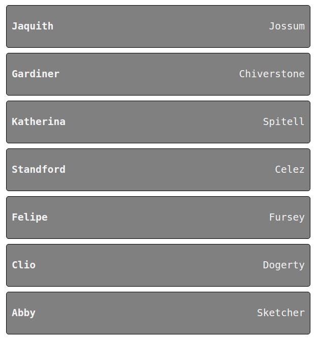
<app-contact [ngClass]="theme" *ngFor="let contact of contacts" [contact]="contact">
</app-contact>
To make it dynamic, we create a theme variable and change it using changeLayoutColor, addColor, and reset
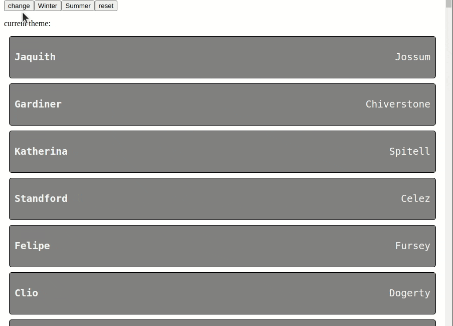
  <div class="actions">
    <button (click)="changeLayoutColor()">change</button>
    <button (click)="addColor('contact-winter-colors')">Winter</button>
    <button (click)="addColor('contact-summer-colors')">Summer</button>
    <button (click)="theme = ''">reset</button>
    <p>
      current theme: {{theme}}
    </p>
  </div>
 theme = '';
  changeLayoutColor() {
    this.theme = this.theme === 'contact-winter' ? 'contact-summer' : 'contact-winter';
  }
  addColor(color:string) {
    this.theme += ` ${color}`
  }
Because the: host pseudo-class applies the styles when the component matches the class.
Create theme relation between components
When we create a component, we can reuse it in some places, and his style should also relate to his container or the context.
We use the host-context pseudo-selector to create a relation between components and match styles with the container or another component.
you can read more https://angular.io/guide/component-styles#host-context
For example, the main app has a button or product component. The button needs to adapt the styles for both of them.
If the product or main app components change their colors, they must react to them. In short, something like:
Let's build something like this using the:host-context selector.
The power of :host-context()
The:host-context pseudo-selector help us to create a relation between components, for example, the product component with the my-app component.
//product.component.css
:host-context(my-app.dark) .content {
  background-color: black;
  color: white;
}
When the component my-app gets the dark class, the product component applies these styles because the CSS selector matches.
Also, we can define multiple relations with our components, like the following example.
Multiple relations
We know how to match one selector to the background, so let’s build multiple selectors with the new rules.
The background to white smoke when the
app-productgets to the day class.The background to blue, when
app-productget the .dark class.The background to pink when the
my-appcomponent gets the .dark class.
Edit the button.component.css, and add the following lines to affect the .btn class selector.
//button.css file.
//Relation with app-product with the day class
:host-context(app-product.day) .btn {
  background-color: whitesmoke;
}

//Relation with app-product with the dark class
:host-context(app-product.dark) .btn {
  background-color: black;
  color: whitesmoke;
}

//relation with my-app with dark class
:host-context(my-app.dark) .btn {
  background-color: pink;
  color: white;
}
Perfect! The button component relates to the parent and the main app component.
Feel free to play with the demo if you want to see a small real demo and see how child components react to the relations between components.
https://stackblitz.com/edit/host-context-angular-demo
Done
That's it! Hopefully, that will help you set the theme, colorize your components, and make dynamic and link style relations between components using the host-context pseudo-selector.
That's it! Hopefully, If you enjoyed this post, share it!
Feel free to play with the demo theme-angular-components.surge.sh